SG BREWING CO.
Collaboration with Brand Elect
DESIGNING A STANDOUT BRAND FOR A NEW BREWERY AND IT’S SIGNATURE BEERS
When I was first introduced to SG’s owner, Nicky, it was obvious this was the kind of guy that loves pub culture, good beer… oh and goats! So much so that he even has his own pub at the end of the garden… The Staggering Goat.
Nicky and the other directors were on the same page that socialising, community and beer were a perfect combo and so they wanted to create something of there own that was a mix of passion project and the perfect beers to reflect these values.
Nicky felt that most beers were either aimed too much at men or craft beers were seen as overwhelming or less accessible for the average drinker. They thought this was reflected in many different ways, from the public image to design all the way through to the taste itself.
His goal was to make a premium beer that was more relatable to a wider market, no more beer for just the geezers, change the optics of craft beer from being pretentious. He wanted friends, couples, lads, lasses and everyone in between to get excited about great tasting beer and ultimately nurture that sense of community – but how the fuck were we going to achieve that?
FROM HOME BAR TO CHARACTER DRIVEN BEER FOR EVERYONE
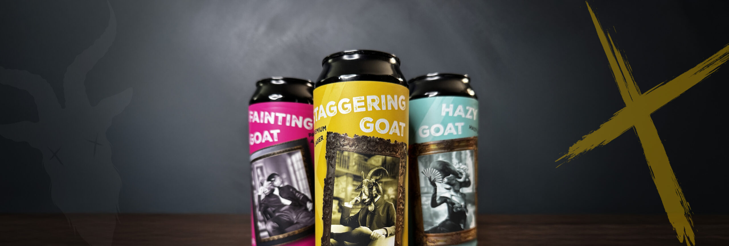
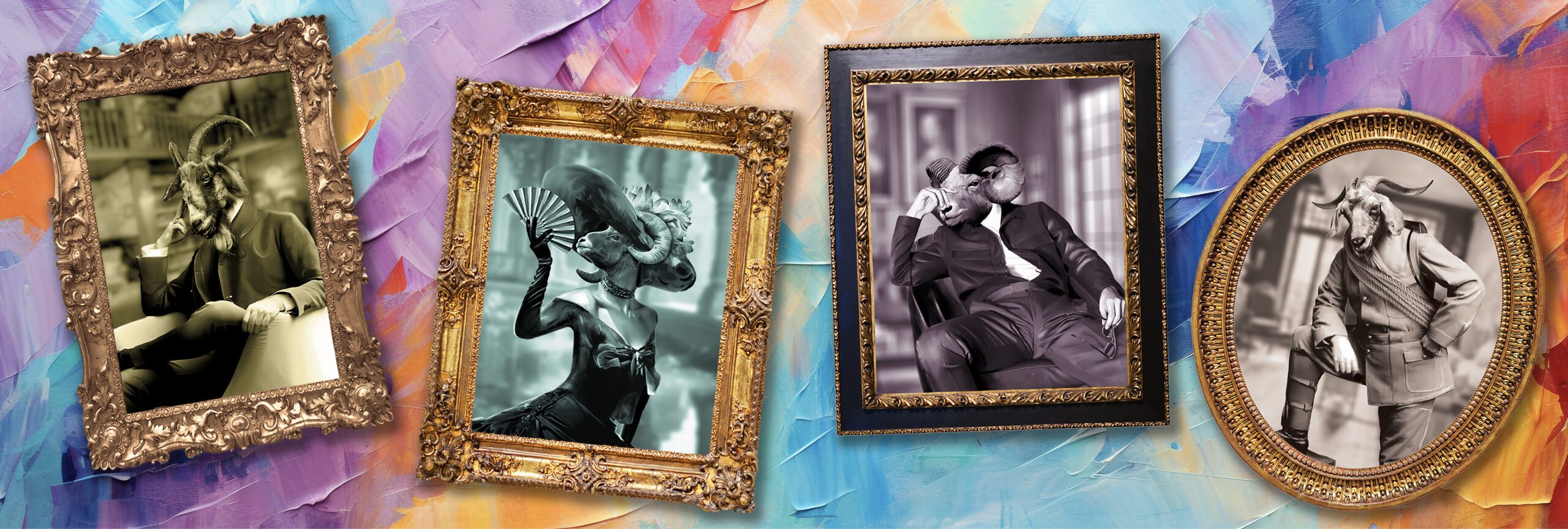
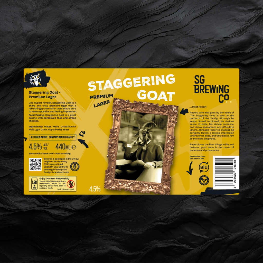
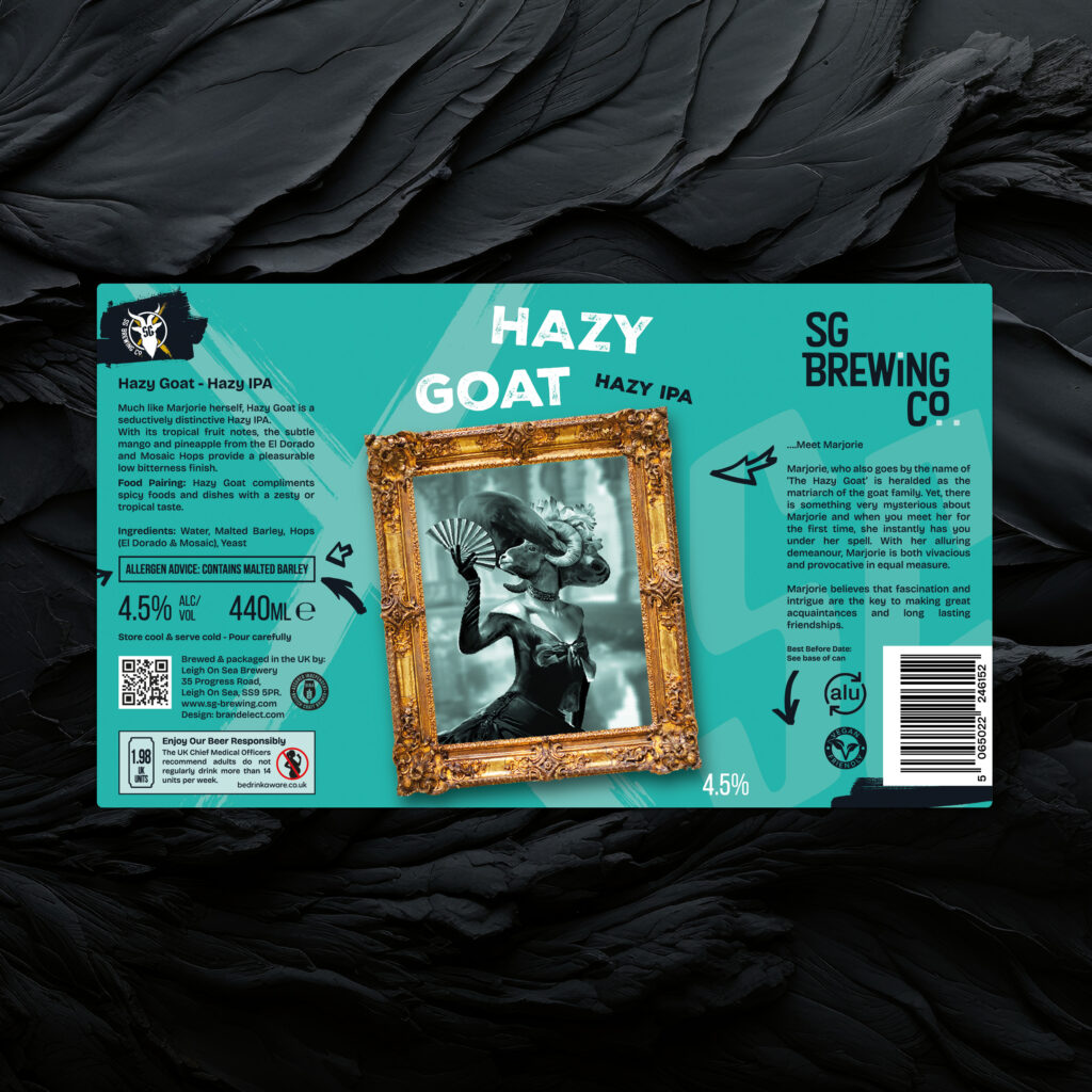
The solution lay in the goats!
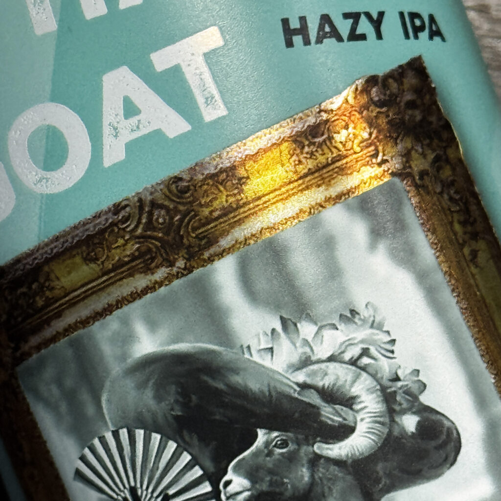
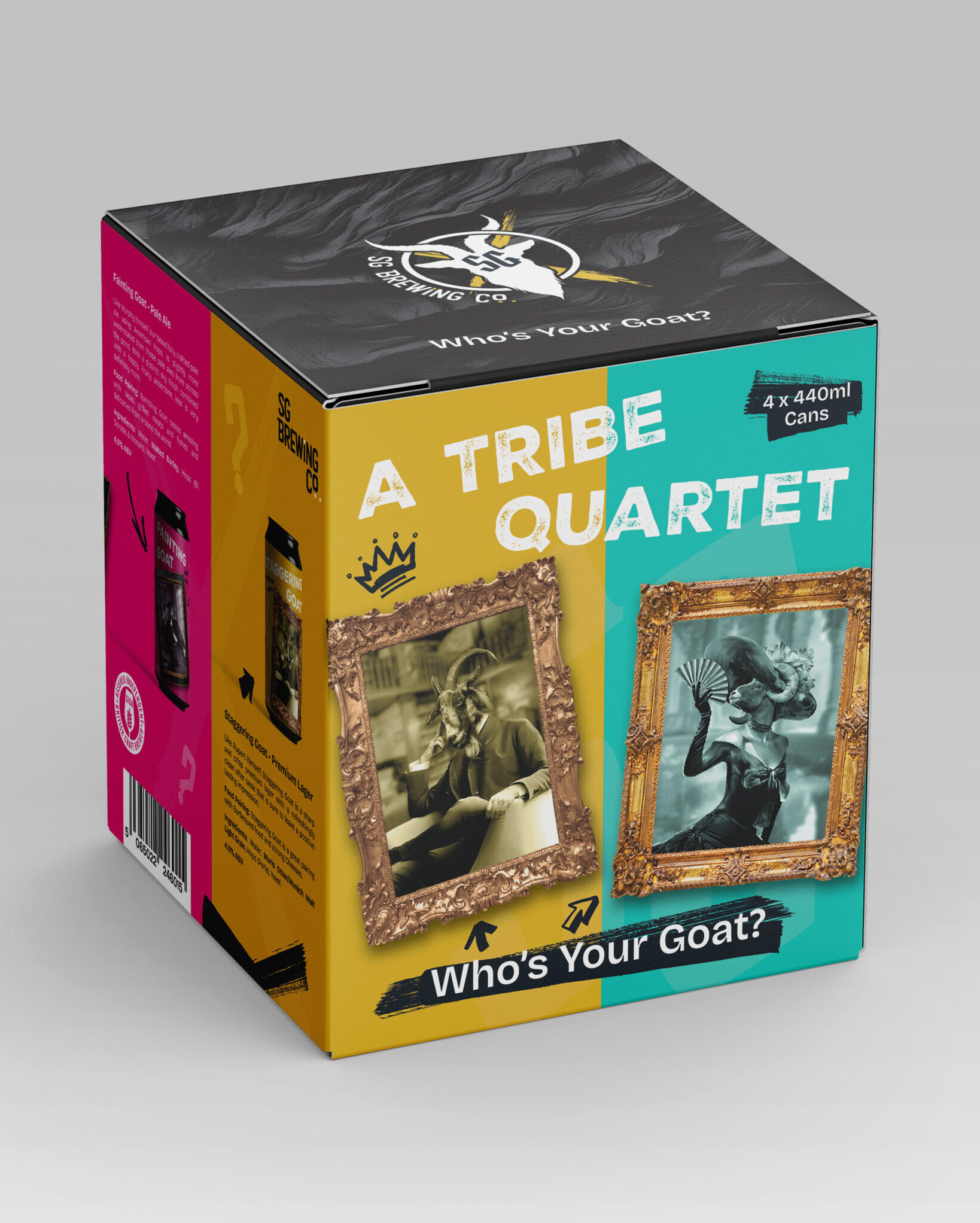
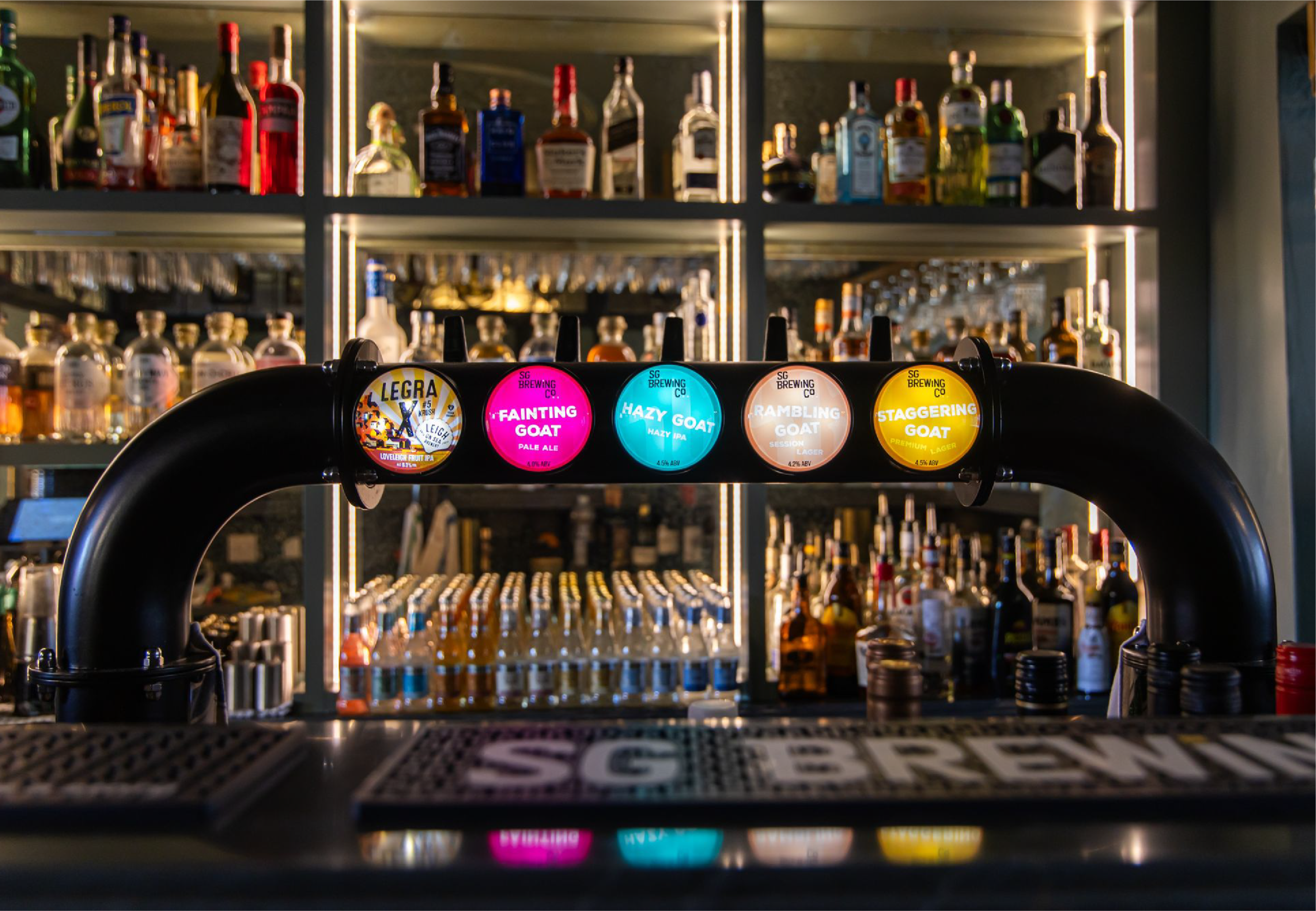
We made the goats the heroes. Each goat character has a unique name, persona, style and back story tied to the individual beer flavour – creating intrigue, memorability, and a playful yet premium brand personality.
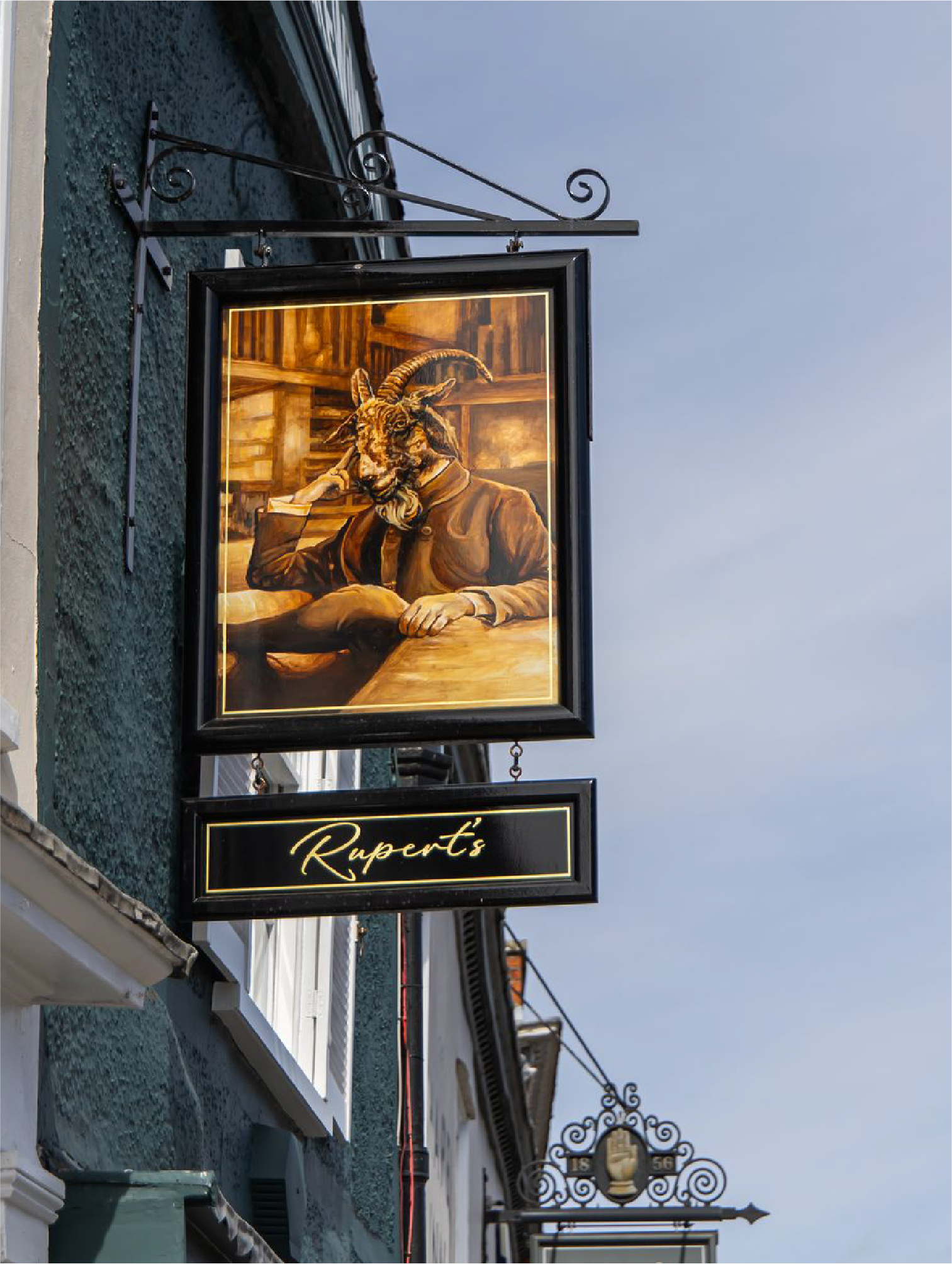
I took inspiration from Nicky’s home pub which is covered in portraits of goats, living life to the fullest, each picture telling a story and making you feel at home, like you were sat by the fire with you friends and family in a cosy country pub looking at hundreds of years of history strewn across the walls.
The journey started with the label design being the clients main focus and despite this not being mine or Brand Elect normal process we obliged and I began designing some label concepts along side the brand mapping process, allowing us to help the client feel comfortable and confident all while creating the brands story, it’s values and its personality.
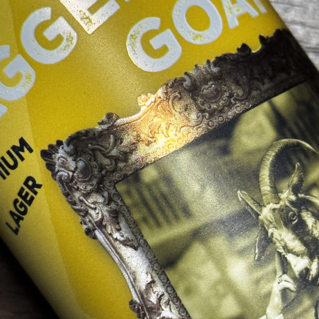
Initially the feeling from the client was that the label concepts should feature red and blue as hero colours however as we all began to understand what they wanted to achieve with the brand identity these didn’t feel right any longer. So, moving away from common colours within the beer industry that also feel masculine I looked towards more bold, bright colours with real punch, eventually settling on yellow as our hero brand.
STAGGERING INTO SUCCESS
Once the client felt we were heading in the right direction with the concepts we refocused on building the brands identity as a whole, starting with the logo.
Taking my sketches, some aspects of the early label concepts and bringing in some elements of tattoo culture I began to put together the individual parts of a strong logo filled with personality.
The first of these parts was the wordmark, having found a clear but quirky typeface that matched the brands personality I began making a few small tweaks to make it their own.
Next came representing the goat itself. With SG standing for Staggering Goat the image of a drunken goat was always there so when creating the final logo I wanted to represent this in a fun way. Firstly was the decision to have the goat silhouette at an angle to show it staggering, next was to have it seem like it had stumbled into something. I added a circular frame surrounding it and gave it the effect of the goat breaking through with one horn in front and one behind.
To start with I kept finding myself doodling drunken goats with crosses for eyes and I loved that it was adding so much character. However when the logo was to be at a smaller size on things like bottles and cans they would be lost, how could I still include this cool little asset in the logo still?
Sure, I would definitely use the cross eyed goat as an asset elsewhere but I still felt that the cross needed to be used in other ways so I played around with clever ways of including it but it turns out the simplest idea was the most effective, make it bigger, put it behind with the logo at the centre.
The final element was the SG monogram, since the start of the project I had lent in to some of the initial direction of the bottles looking dark and moody, mix that aesthetic with goats and I went straight to the occult and that led me to blackletter. Most of the styles I had looked at were very detailed and ornate, again not great at a reduced size, but after a lot of searching I found a typeface that fitted the bill.
Initially I had intended this to be used as an asset in places like bottle caps or packaging but with the goat no longer having crosses for eyes something felt empty in the centre of this great logo then it struck me that my initial label designs had a black goat with the SG glowing out of it’s head!
With all these components finally coming together I had it, the finished logo that was strong, full of character and versatile. We presented this to the client and I am pleased to say they fell in love with it!
After that it wasn’t long before I found the rest of brands personality and could really envisage how it would look served behind bars and on shop shelves and because of the journey we shared with the client they could too.
WHO’S YOUR GOAT?
With the goats at the heart of the brand, myself, the guys at Brand Elect and even Nicky’s own tattooist set about bringing these characters to life…
..Introducing Rupert, Marjorie, Murphey and Nigel!
Our hero characters were born, the beers were being brewed and the brand felt complete. Time to push this AWESOME brand to the next level with packaging, merch, beermats, pump lenses and even a brand new taproom to serve their core beers. From this point onward anything goats!
SG is about burst out into the real world and tell their story to all who’ll listen over a delicious cold pint of Staggering Goat.